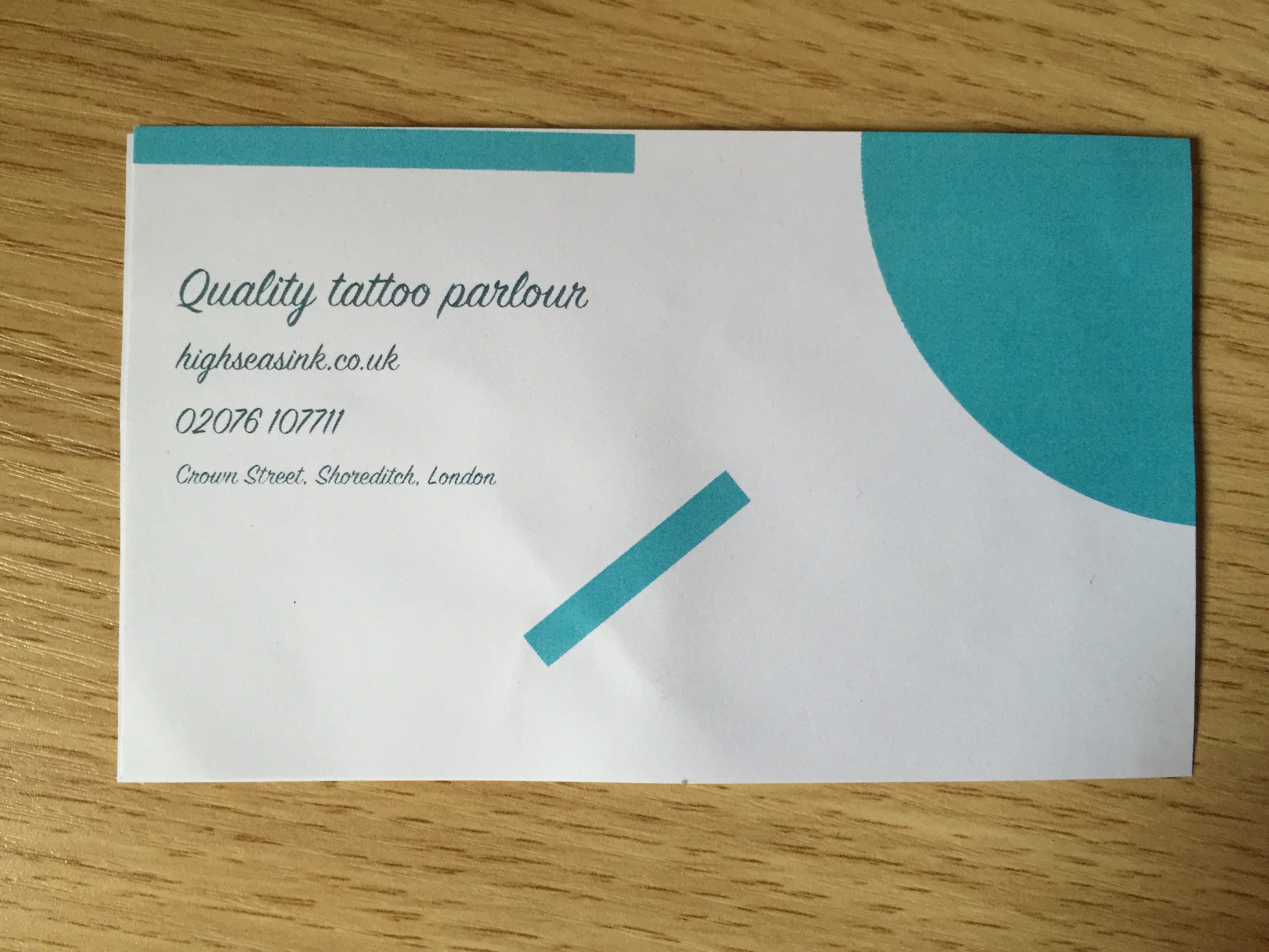
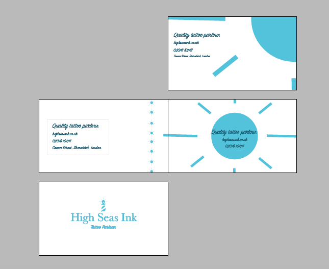
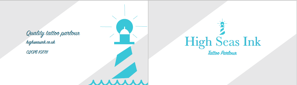
Started off with:

One sided leaflet following original grey stripe colour scheme.
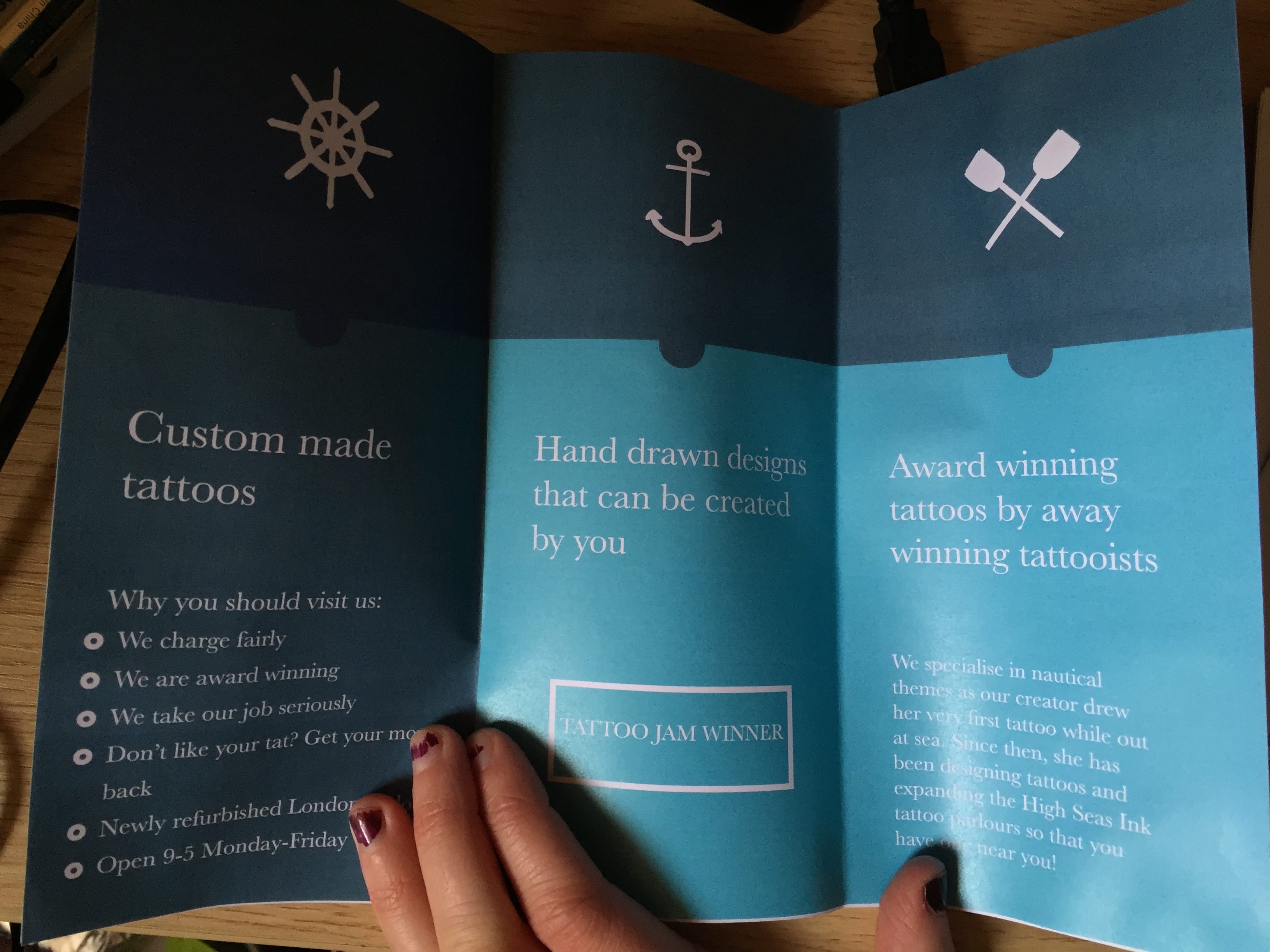
Changed to:
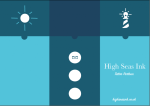
New blue colour scheme A4 leaflet (folded) with simple nautical vectors that I created on Illustrator.
Small details:

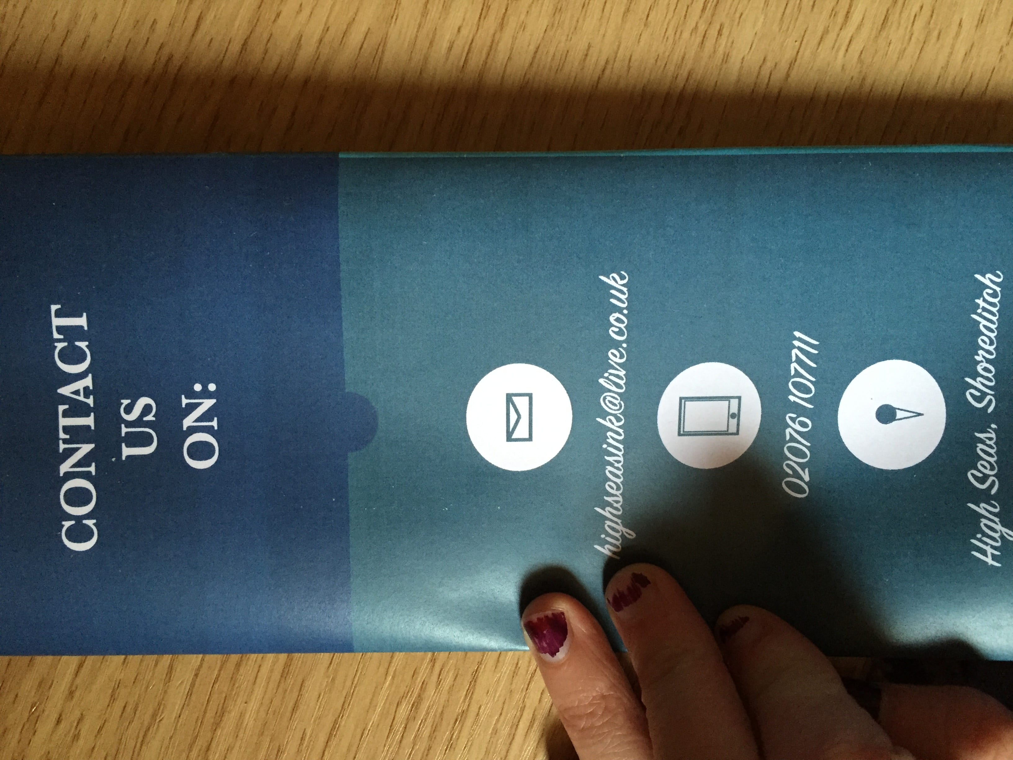
I created small vector icons for the contact details (a phone, email and location pin). These are just little details to make the brochure look more interesting and to add my own touch to them.

I created a map of where the parlour in Shoreditch is (the main tattoo parlour for the company). The map is of a real area in Shoreditch where the tattoo parlour would be.

To help with the transition between the lighter and darker areas of the brochure, I used these little half circles to introduce the colours to each other. I did this with my infographic last term too as I feel it just helps when you are using to different colours against each other.

I created my own bullet points instead of using the ones that are available on Indesign. I wanted to use real circles as they tie in with the circle shown in the image above as well as the sun behind the lighthouse on the logo.