Before creating my brochure, I decided it would be best to look at some on Pinterest to identify what I like and what makes a good brochure.
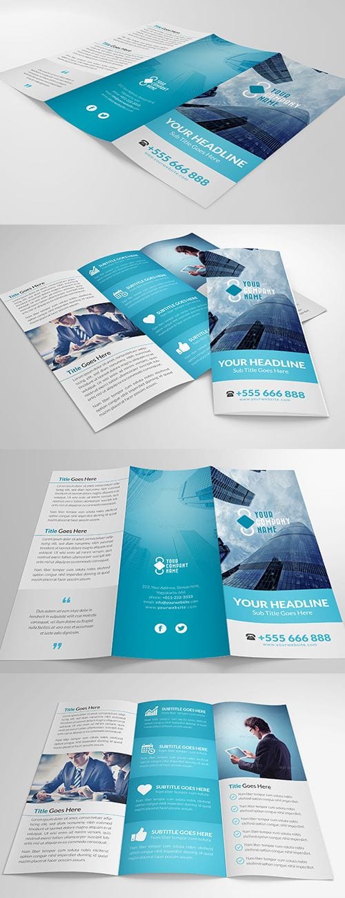
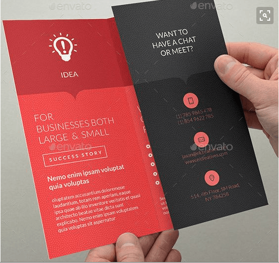
I really like the simple colour scheme used in both of the brochures above as well as the use of simple vectors and complimentary fonts. I like the ‘Z’ shaped fold as well and may use this with my own design. I love the use of a darker box along the top of the second brochure design, adding a little more interest to the page. I may also attempt this with my own design.

This is one of the better tattoo brochures that I found (along with business card). I feel it is quite successful and traditional but it does not follow the simplistic design style that I like.
Leave a comment