For our brief, we had to make sure our infographic would fit an A2 page, a smartphone screen and a desktop.
To create my infographic, I started off by making it with A2 dimensions. This means the text can be smaller as if this infographic were to be printed, it would all be blown up to fit an A2 page. I also decided to make it a long, thin design (as long as an A2 page but thinner/in need of cropping) as a lot of infographics are a long, thin shape. I also added a bleed to this page as it has been designed to be printed. This is my A2 infographic:

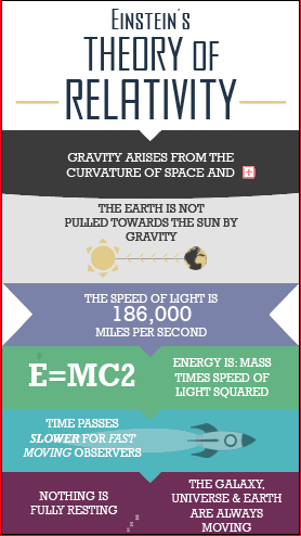
For the phone layout, as well as shaping my infographic to the dimensions of a phone screen, I made the text bigger so that it is more legible from a smaller screen. I stuck to the long, thin, style, but just enlarged certain areas so that you can read it on a phone. To check it would work, I placed my phone against the screen and made my infographic the same size next to it to ensure I could read it. Here is my phone infographic:
For the final layout, I had to totally rethink my infographic. A desktop is landscape and my design had previously been portrait, so I had to create a new grid that would fit a landscape page. To make sure there was still hierarchy, I made the boxes to the left (where you start to read a page from) larger and the text bigger, and then made everything smaller as it goes across the page. I also used square boxes instead of rectangles to divide my information as it fits the page better. Luckily, as I already had a colour scheme at hand and all of the text available, this did not take too long to do. Here is my desktop layout:

Final tweaks will be made to these before I submit them, but for now I am happy with how they look and the progress that I have made.