When changing some of my letters such as the A, I had to consider the positioning of the terminal/finial (not sure what the tail of the a is technically defined as).
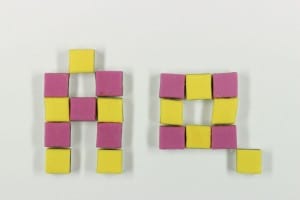
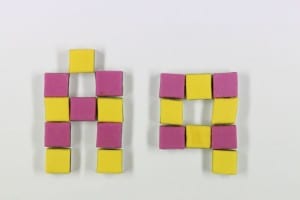
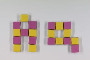 I think the positioning of the tail looks best in the middle photo. This time I followed a grid system with my A as it did not particularly fit with the rest of my letters last time. I like how it turned out this time although (even though I did not move the lights or my camera at all) I am struggling to get the colours the same on each photo.
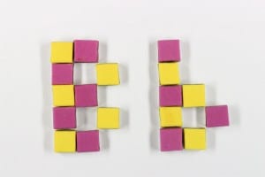
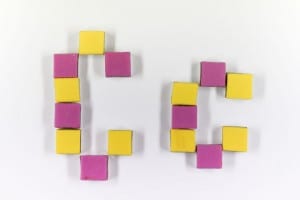
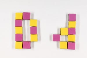
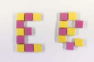
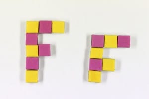 Here are the rest of my letters. I feel the grid system works better on all of them this time. I do not understand why the colours varied so much on them when I did not touch anything other than the sweets when taking the photos, but overall they look quite good.
I also had a play about and created an italic letter to experiment with other forms:
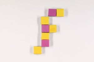 This is to give people an idea of what an italic form of my typeface would be like.
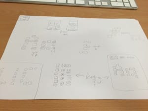
I also gave knolling a go here:
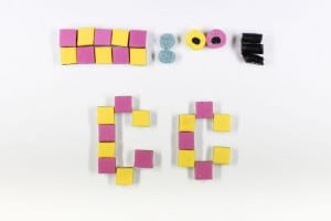 I have realised when looking back at my photos that the sweets are not completely straight. I did not realise this at the time when putting them together but I still think that this worked fairly well with demonstrating what sweets I used to create my typeface.
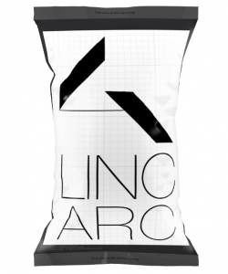
Here is the word ‘Lic’ which I would potentially use for a brand:
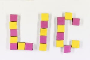 I had to think up an L and I for this, but it was not too difficult as my letters needed to fit to a grid. I feel this looks fairly good as a brand name and is pleasing to the eye for children (who would be the main target audience).
