David McCandless is a London-based information designer who works across multiple platforms. He has written several books including Knowledge is Beautiful, Information is Beautiful and the Visual Miscellaneum. The books all include countless statistics on everything from dog breeds to pop music using beautiful designs and illustrations. I think his work is incredibly eye catching and here are some of the pieces that I specifically like:
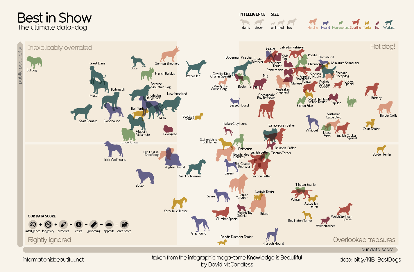
For what seems to be just a scattering of dogs on a page, this actually contains a lot of information. The intelligence, size, dog type and even more are on this poster. The colours all compliment themselves well and I like how he has separated out the grid with a middle area. It is easy to understand and not too serious which I also like.
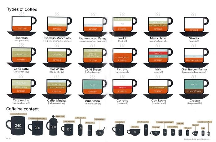
I don’t juts like this because it is about coffee. I also like how each drink is described in the same way but with using different colours to separate the different elements. It also shows how they are all served, proving helpful to coffee drinkers and makers.

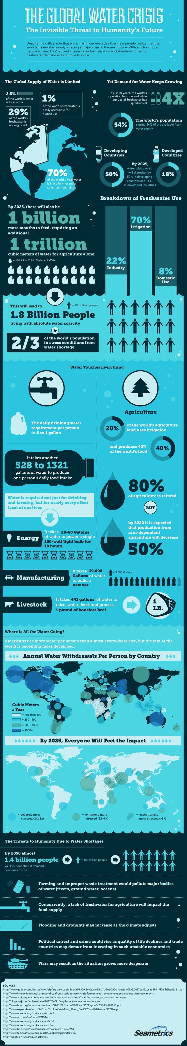
Although I don’t find the colour scheme particularly exciting on this infographic, I like how all of the elements are divided up into a grid and how easy it is to read, making it incredibly accessible. The main facts are also in bold, making it easy to pick out the information that you want.