http://www.creativebloq.com/web-design/why-web-design-losing-its-soul-51514950
“I feel like responsive design has sucked the soul out of website design. Everything is boxes and grids. Where has all the creativity gone?”
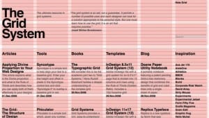
I do not agree with this – I am afraid that without grids, design looks messy and is a lot less easy to read. If websites such as BBC did not follow some sort a grid system, the information would be all over the place and you would never be able to find the stories you want to read.
Personally, I like things to be lined up anyway – books on a shelf look better lined up, posters on a wall look better central and straight and everything on this planet looks better when it follows some sort of grid. I do not think that it means there is a lack of creativity, it is just simply a rule that you have to follow.
The only type of design that does not particularly need a grid, is for if you are using a scene or an illustration:
This is because parts of it like the countryside behind would look a bit odd and unrealistic without a grid. However, there is still a strong layout in this image – things are not just placed randomly.


Leave a comment