Next I needed to explore more into infographics. Generally an infographic is a visual representation of information/data/knowledge.
Here are some infographics that I found and specifically liked:
![]()


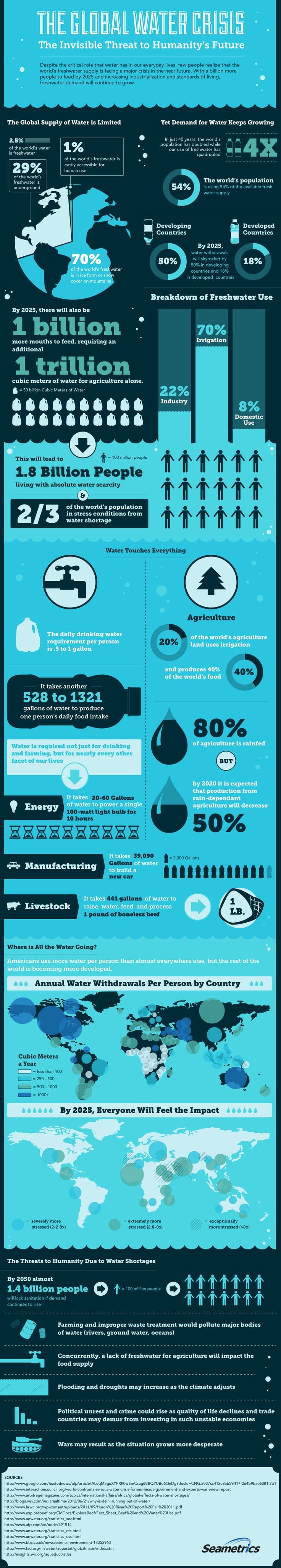
Key points on these that I need to include:
- Grid system
- Adobe Kuler colour scheme
- Sophisticated vector graphics
- Other visual representations like pie charts and graphs
- Lines and colours to separate different sections
What I like about them is that where a paragraph or large chunk of text would generally be off-putting, an infographic is actually pleasing to the eye and draws you in to learn instead of boring you or pushing you away.
So I have already decided from this that my infographic also needs to be pleasing to the eye.
The only thing that I have created that is similar before is an infographic for coffee, where I was just simply playing around with Adobe Illustrator to get to know the tools a bit better. Here is what I created (not finished):

Leave a comment