Tufte was a statistician and a pioneer in the field of data visualization. He is particularly an expert with information graphics like charts and diagrams. He is also known for criticising Powerpoint, saying it has poor typography and simplistic tables and charts. Tufte has written several books including ‘The Visual Display of Quantitive information’, ‘Envisioning Information’ and others.
Here are some of his infographics that I particularly like:

I really like the simple use of just red and blue in different shades to represent the statistics for Scarborough. This proves that you do not need to use loads of colours in order for your infographic to be successful.

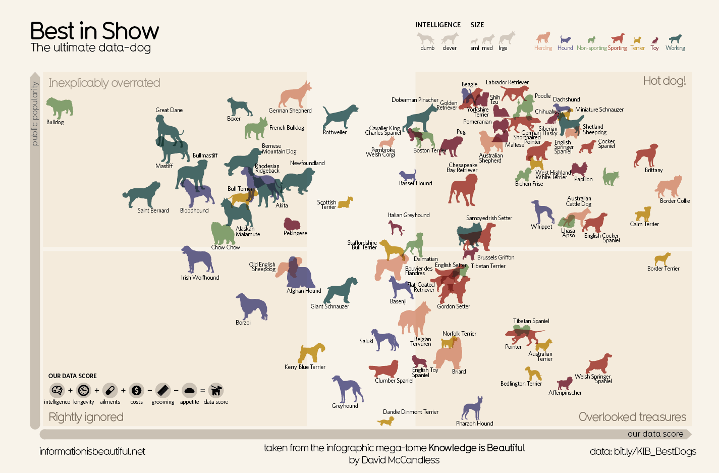
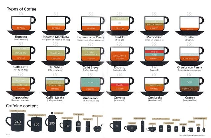
This is my favourite of his infographics. The typeface really suits the theme, I like the choice of background and brown colour theme. The darker lines that connect the diagrams also make the poster easy to follow. In addition, the vector graphics work well on the poster with showing which coffee is which.
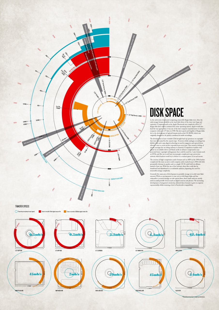
This reminds me of Josef Muller-Brockmann and Bauhaus designs. The jagged shapes and circular design all works very well together as it looks like a disc broken up. I also like the old paper look background – it just makes the page look a bit more interesting.