Food Type
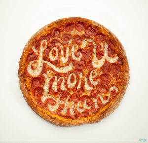
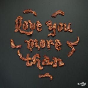
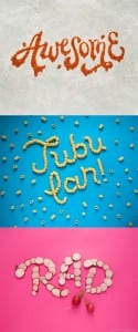
I have found a really cool food typography creator called Danielle Evans. She has worked for Kelloggs and other large companies making a lot of food-related photos and typefaces. There are also loads of videos on her Instagram showing you how she makes her food type. Here are some examples of her work:
( http://marmaladebleue.com/ )
Studio Planning
Before going in the studio to take some more photos of my letters, I decided to draw out what I was thinking about so that it would be easier and faster when it came to being in the studio. Here are my ideas:
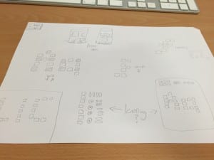 I need to take a photo of ‘LIC’ so that I can hopefully place it on some packaging and place my typeface in the real world. I will then have a go at knolling to see if it works or not with my sweets.
PSD Mockup
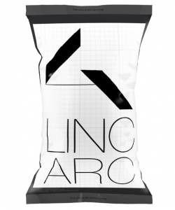
So that I can place my design onto packaging and perhaps some form of advertisement, I have been having a play about with PSD mockups. Here is a convincing bag that could be used as my sweet bag:
(I used my previous logo made just to temporarily place on the top)
I like the crinkles and the detailing on the bag, I think it will look good as a bag of sweets. I have now also learnt you need to download a PSD mockup with an action plan so that it can place your template on the image for you instead of you having to do it manually.
Things to Think About
Here is a picture of my typeface laid-out on inDesign:
 Points I need to improve on:
- Make sure I stick to one orientation when taking the photos. Although they are all the same size, some do not look as good in portrait.
- Make my typeface into more of a grid system – stick to a grid with the ‘A’ and lower case ‘F’
- Create a few italics letters like the lowercase ‘F’
- Perhaps have a go at taking the upper and lower case letters separately and all together
- Have a go at Knolling?
Things that worked well:
- The colour scheme
- The grid system on the rest of the letters
- The lighting in the photos
I have re-booked the photography studio for tomorrow night so that I can retake some of my photos then.
