Front cover creation…again!

I have finally decided that I have come up with a design that I like (for now).

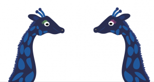
As all of my drawings of giraffes have been unsuccessful and do not really tie in with my other simplified characters, I have decided to use the two giraffe heads that I already have. This has created quite a symmetrical styled cover which I think is fairly appealing to the eye.

For the background, I tried out many different bright colours including mustard, lime green, orange and pink. Overall, the bright pink worked best for the background as it complimented the blue giraffes best. To add a little interest, I also added a lime green border to the outside to liven the cover up a bit.

Here is my current front cover:
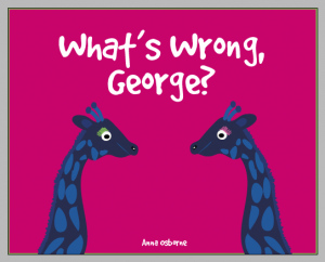
Screen Shot 2016-04-06 at 16.06.26

More character creation

I have now progressed to colour all of my characters so that they all follow my basic animal theme and all consist of around 3 colours.

I am basing my work on Chris Houghton. Chris is an illustrator and has created some of my favourite children’s book front covers including Little Owl Lost.

Here are some of his other illustrations:

118586-7178133-2008_cara_magazine 118586-7155983-2009_if_you_could_do_anything_what_would_you_do_tomorrow

I love his simplistic designs and small colour schemes. Along with children’s books, he is also interested in Fair trade and non-profitable designs which is really interesting. I have chosen to base my work on his as I feel like I could also make simple designs (I am not the best drawer in the world) and hope they can be as successful as his. I also think that they are pleasing to the eye and work well in children’s books.

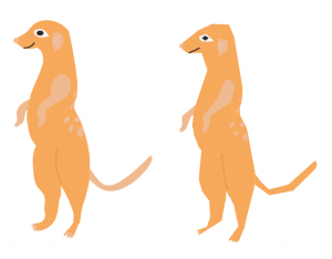
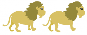
Here are my characters:

Screen Shot 2016-03-19 at 17.42.59

Manny the Meerkat

Screen Shot 2016-03-19 at 17.43.12

Leo the Lion

Screen Shot 2016-03-19 at 17.43.23

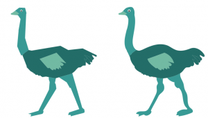
Ollie the Ostrich

Screen Shot 2016-03-19 at 17.43.32

George and Grace the Giraffes


The reason why I have created two of some of them is to show the difference between the original and the simplified illustration. I initially drew all of them on the graphics tablet and then simplified the paths that I had drawn and filled the animals in to get them to where they are now.


Neil Baker

Today we had a guest lecturer called Neil Baker. I really liked his illustrations of different birds and places which is why I thought I would put it on my blog.

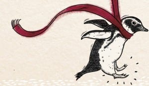
I love his penguin design:

the-penguin-lessons-hi-res-crop-for-blog1-1014x586

His drawings are incredibly realistic and he has a real eye for drawing. I also like the way they have been coloured in and placed on textured paper. The book illustrations are very aesthetically pleasing.

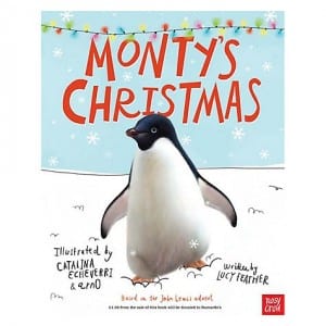
His penguins did make me think of the John Lewis penguin a bit:

boo_475

I don’t understand how he colours his penguins in so well but I would love to be able to do the same.

My front cover

I have begun to design my front cover.

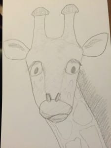
First of all I needed to draw a giraffe that I want to go on the front. I noticed that the four front covers of children’s books that I looked at tended to have one main character and possibly another or some detail with it on the front. I have decided to put George on the front of mine looking very unhappy. I gave him cartoon style eyes instead of standard giraffe ones as I want his face to appeal to young children. This is my drawing of George which I will scan in:

IMG_6124


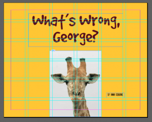
This is an idea for the front cover of my book. The photo of the giraffe will of course be replaced with my drawing. I like the hand-written style font that I have chosen. I want to have a mustard background but will have to see how this goes with my drawing as it is a similar colour to giraffe fur.

Screen Shot 2016-03-09 at 16.33.29

Front Cover design

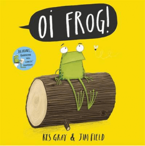
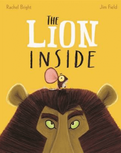
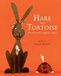
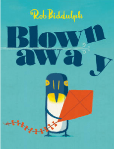
Here are some screenshots of front cover designs that I like from the Waterstones website:

Screen Shot 2016-03-09 at 14.36.54 Screen Shot 2016-03-09 at 14.37.32 Screen Shot 2016-03-09 at 14.38.07 Screen Shot 2016-03-09 at 14.39.28

Common occurrences with the front covers:

  • Large, centralised title
  •  Author’s name smaller than title
  • Bright backgrounds (single colour)
  • Quirky illustrations of animals
  • Top 2 typefaces are hand-drawn style
  • Bottom two typefaces are more traditional
  • Small details like wind and a fly added
  • Simplistic!