Before taking my photos tonight, I decided to draw out all of my letter ideas on Illustrator to speed up the process tonight and to help give me a basic plan. Here is my proposed letter plan:
I understand that I may have to change some of these when it comes to making my alphabet depending on how well my sweets sit and how they look. I feel this is a good start though.
Third lesson
Today we had an Illustrator induction where we followed a brief to create a logo. Here is the logo that we were asked to create:

This workshop was helpful as a refresher as I have not used Illustrator for a little while and it reminded me how to do a few things. I am not sure when I will use Illustrator in this first brief but I am sure I certainly will soon.
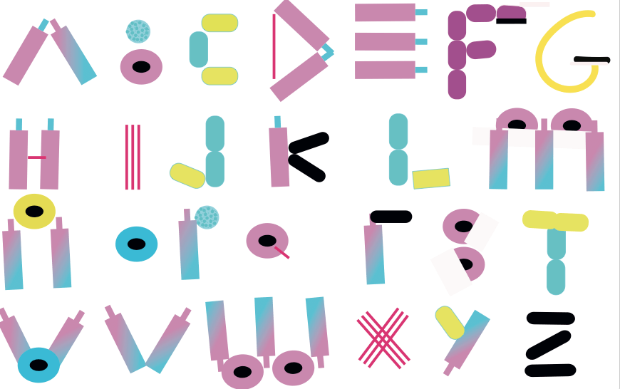
Sweets test
Before going into the photography studio tomorrow, I thought I ought to test out my sweets to make sure they actually make convincing letters and work well together.
Here are some pictures of my initial idea, where I am just using the sweets to make the shape of the letter:
 I like how this worked, although I may not use the red laces as much on letters such as the B as I feel the letter would work fine with just the two liquorice allsorts instead. The colours also work fairly well together although they are different levels of brightness. However, this is something that can be adjusted on Lightroom later on so it is not a massive issue.
Here was my second idea:

This did not work so well. It appears more childish as the lace did not want to stay in place. I don’t think using the outline of the lace is as effective and therefore will not be using it in this way.
After choosing the first idea, I faced a few problems in terms of how to create each letter. For example:


Do I use the fourth sweet at the back or not to create the E? I think overall with the other letters on the page, it will look better and more original with just the 3 sweets instead of 4 but I can always add the extra sweet if necessary.
Food Photography
I have never particularly photographed food before, other than casual snaps of meals out etc, and so was not sure if there are any dos and don’ts when taking the photos.
I found this BBC article which is fairly vague for all foods but is quite helpful:
http://www.bbcgoodfood.com/howto/guide/how-photograph-food
I was planning on using a tripod anyway but it is interesting that it says ‘don’t use a flash’ as I was planning on using flash photography in the photo studio. I may now experiment a little and take some using natural light too to see which works best.
Food Font
Whilst doing research I came across this website:
http://foodfont.com/about/
This is a company dedicated to making fonts out of food. They are an art project that allow you to send in your own fonts as well as participate at events creating fonts with them. Their aim is to build the community around “food, health and sustainability”.
It is interesting that a real company exists with creating food fonts, although I cannot find one purely based on sweets on their websites and they also do not seem to follow colour schemes. I like how they are bringing people together by creating such things though.
