

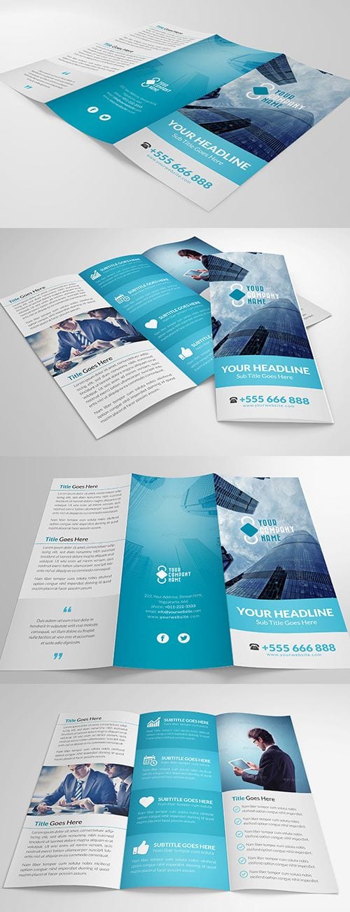
Here is what my brochure looks like.
Things that worked well:
- Use of vector images
- Blue colour scheme
- Grid system
- Addition of map and contact icons
- Simple design
Things I could improve on:
- Possibly more information needed?
- Feedback given in class
Here is what my brochure looks like.
Things that worked well:
Things I could improve on:
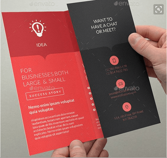
Before creating my brochure, I decided it would be best to look at some on Pinterest to identify what I like and what makes a good brochure.
I really like the simple colour scheme used in both of the brochures above as well as the use of simple vectors and complimentary fonts. I like the ‘Z’ shaped fold as well and may use this with my own design. I love the use of a darker box along the top of the second brochure design, adding a little more interest to the page. I may also attempt this with my own design.

This is one of the better tattoo brochures that I found (along with business card). I feel it is quite successful and traditional but it does not follow the simplistic design style that I like.
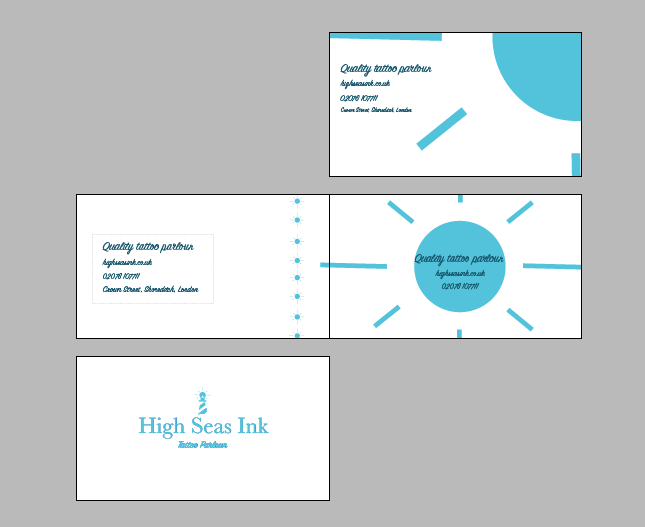
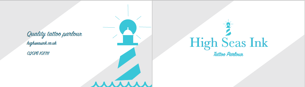
These were my final business card ideas. I decided to work with the sun from the logo for my business card as it brings the brand together and gives the brand an identity.
From these four I then chose this for the front of the business card:

and this for the back of the card:
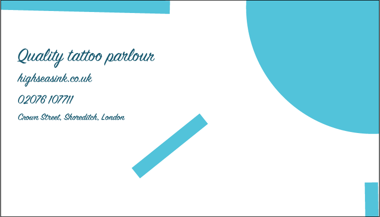
I went for a plain and simple front to the card to make the company look professional. I want them to give off an impression of knowing what they are doing and being high-end and trustworthy instead of some dirty, backstreet parlour.
I then wanted the back to be a bit more fun and just show the information that someone may need. If they then want the opening times or any further information about the chain, they can check the website or give the company a call. I put the Shoreditch address on as they are the base shop and where the brand began.
Thoughts and adjustments:

This is a moodboard I have created of all different layout designs that I think are successful (from Pinterest).
I have noticed from this that I quite like designs that are centralised. I also like the use of squares and the addition of one colour (yellow in the moodboard above) to add some interest to the design. I may incorporate some of the different layouts that I like into my brochure.
After creating this moodboard, we then has to move a layout about to create new layouts. Here is one of my better choices:

I prefer the less text-heavy designs. The grey could be used as a background pattern or photo depending on what the use of this design would be. I will take some ideas from what I created.