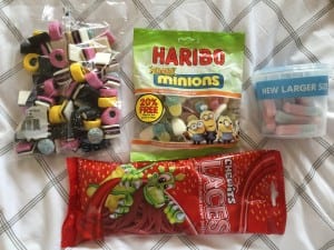
Before going into the photography studio tomorrow, I thought I ought to test out my sweets to make sure they actually make convincing letters and work well together.
Here are some pictures of my initial idea, where I am just using the sweets to make the shape of the letter:
 I like how this worked, although I may not use the red laces as much on letters such as the B as I feel the letter would work fine with just the two liquorice allsorts instead. The colours also work fairly well together although they are different levels of brightness. However, this is something that can be adjusted on Lightroom later on so it is not a massive issue.
Here was my second idea:
This did not work so well. It appears more childish as the lace did not want to stay in place. I don’t think using the outline of the lace is as effective and therefore will not be using it in this way.
After choosing the first idea, I faced a few problems in terms of how to create each letter. For example:
Do I use the fourth sweet at the back or not to create the E? I think overall with the other letters on the page, it will look better and more original with just the 3 sweets instead of 4 but I can always add the extra sweet if necessary.


