Yesterday I went in the studio and took these photos:
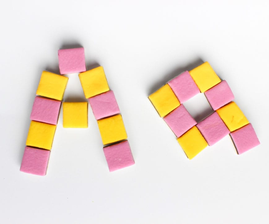
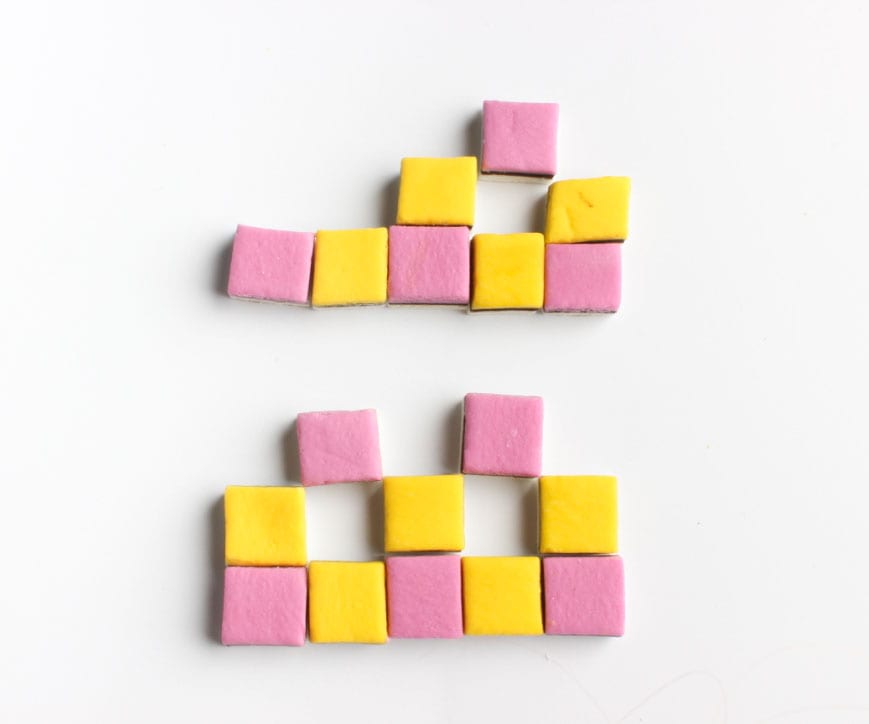
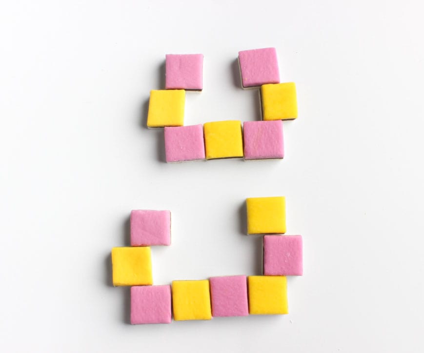
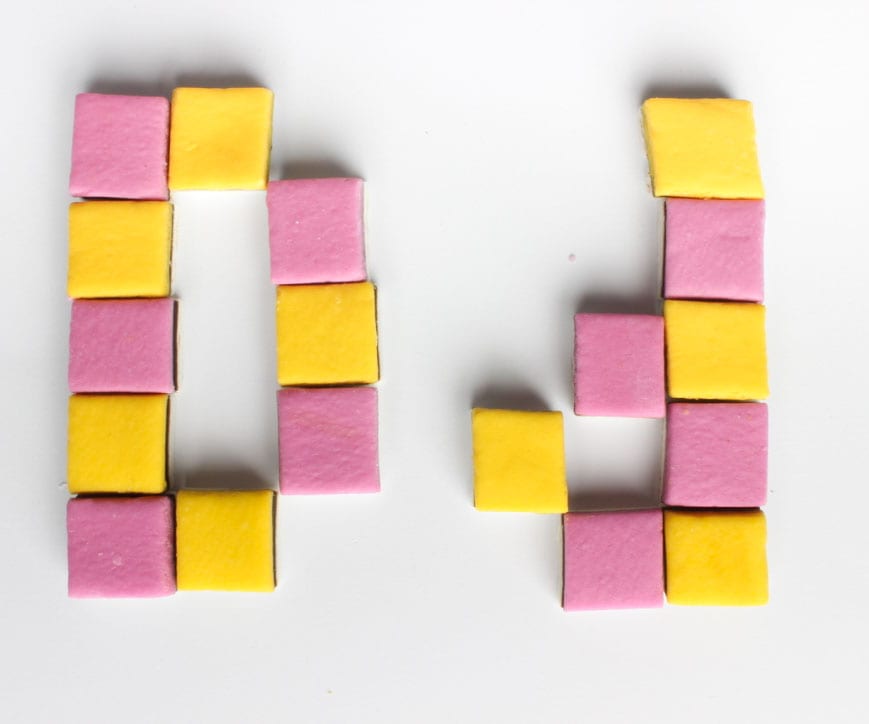
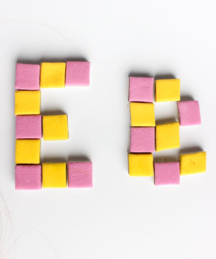
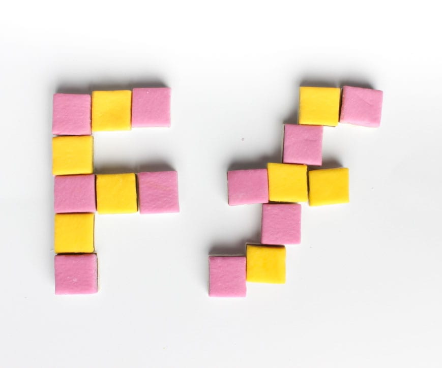 After practising with using many different sweets and making a whole alphabet, I found that just using two different coloured sweets actually looked a lot more professional and less like a child had just been playing around. Here are the examples of my 6 uppercase and 6 lower case letters. I like how the liquorice allsorts compliment each other in terms of colour and how they make a nice square font. I might stick with these photos for my final design and just take some more photos of more letters to add to it.
Leave a comment