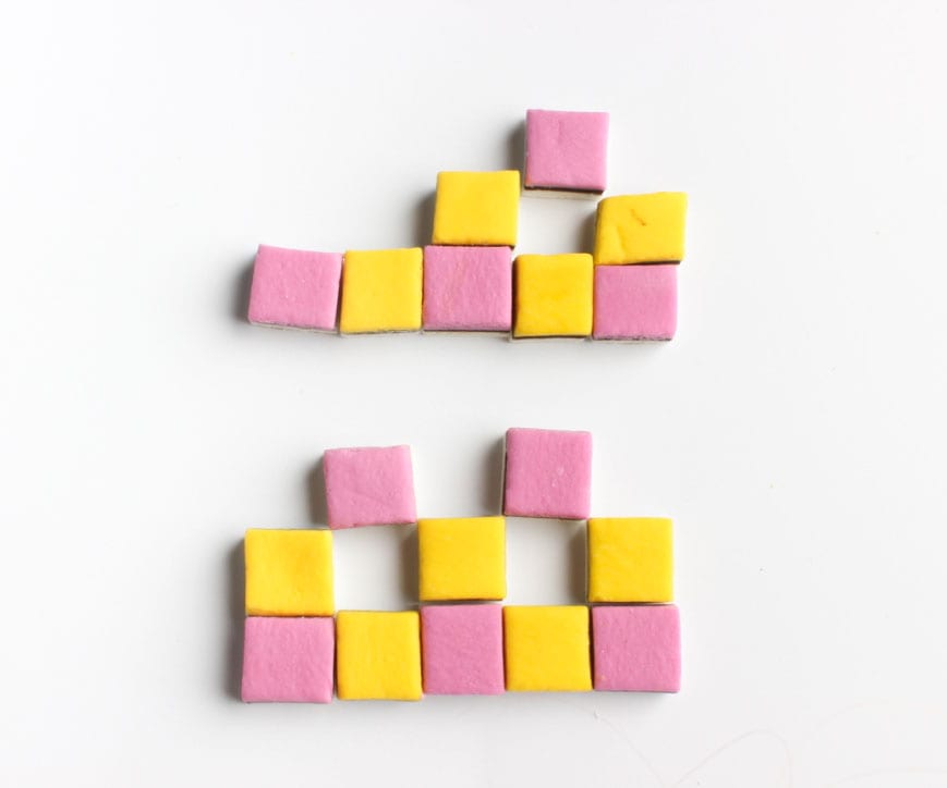
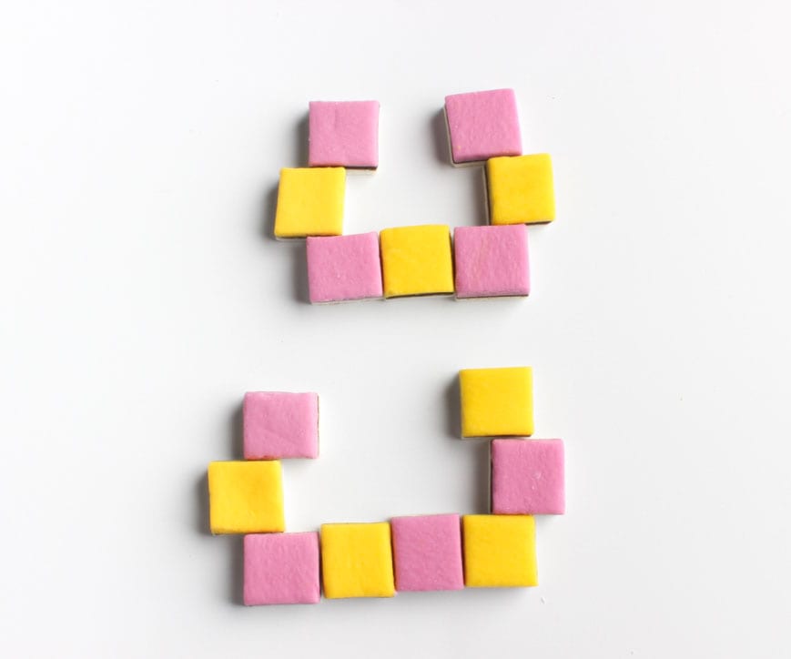
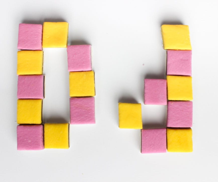
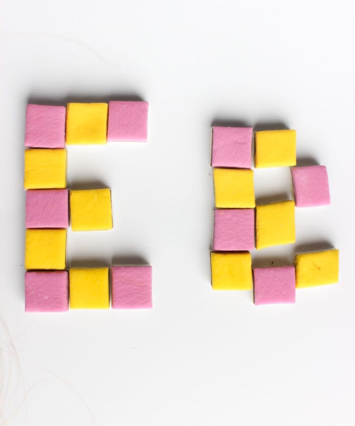
Now that I have come up with my basic typeface, I need to think about what sort of a brand I could apply it to.
The obvious would be for a confectionary company such as:
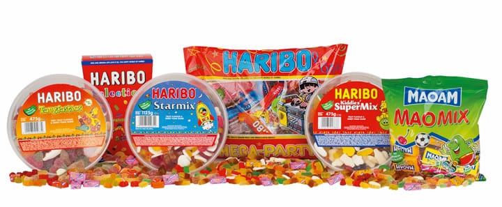
Haribo:
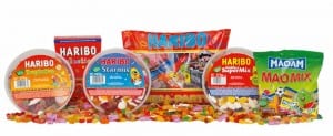 They currently maintain a sans-serif type throughout their packaging. They use a stretchy font that appears to be made from a sweet which makes it fun and appealing for their main target audience: children. Their current typeface is also very easy to use, again making it suitable for their target audience.
Their logo is of a bear, similar to the gummybear product they sell. This ties in with their products as well as what they are as a brand and brings an exciting character to the brand which children would like.
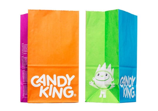
Candyking:
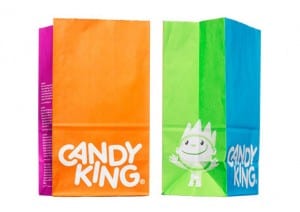 Candy King is quite similar to Haribo in the way that they use a fun, bouncy, rounded, sans-serif font for their title and have a little character to advertise their product too. They use bright colours to advertise their product and for their website and design, attracting the same sort of young audience as Haribo. To photograph their products on their website, they then have a lot of light in the photo and use a white background, similar to my own sweets photos. I am not sure if my multi-coloured typeface would work on their already bright and colourful brand.
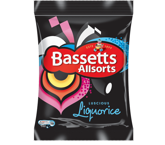
Bassetts:

The typeface for Bassetts is boring in comparison to the two brands above – it is just a white serif font on a red background. Their little logo is then of a man made of liquorice allsorts, which already makes it more suited for my typeface as they actually sell liquorice and use it for their advertising anyway. The design of the sweet packaging itself is already quite bright and colourful which may prove an issue with my typeface?
Own brand?
A different route I could go down would be to design my own sweets brand with packaging and transport etc, as then the colour schemes etc would tie in with my typeface.
I may play about with this idea a little further…
 Points I need to improve on: