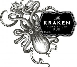
For my website and possibly logo, I have had the idea of having a large octopus on the screen. A brand that already successfully uses an octopus is Kraken Rum.

This is the Kraken logo. I love the hand drawn octopus design with its wild eyes and tentacles waving about everywhere. I also like the way the octopus has been shades with dots. The addition of the boat also works well, as well as tying in with the legend of a rum boat vanishing in the sea and possibly being taken by a giant octopus.
The area around the text looks like an ink splodge crossed with an old fashioned rum bottle label in pirate films. The entire logo does bring pirate films to mind with its old fashioned look and the fact it is rum.
The like the calligraphy style type for the ‘The’ and then the widely spaced sans serif type below. The difference between the white and grey type makes the important areas stand out (the name) adding priority and order to the logo.
This is a screenshot of the website:
The wbsite has a simple layout with the menu bar down the left hand side and then a video taking up the majority of the screen. The use of black and white works well as it makes the product appear as though it is under the sea. Theimages below the video are gifs that move as you scroll down, adding interest to the page. I like the gritty sans serif 3D font on the video and feel it works really well with the pirate style of the page.
 This is a screenshot of the top of one of the pages on the Kraken website. I love the old look to it, as though it is a really old film or chalk board. I like the use of tentacles as the swirly bits above the title of the page as well as the combination of fonts on the page.


