For my proposed design, I wanted to try and draw an octopus to scan in and use. Here it is:
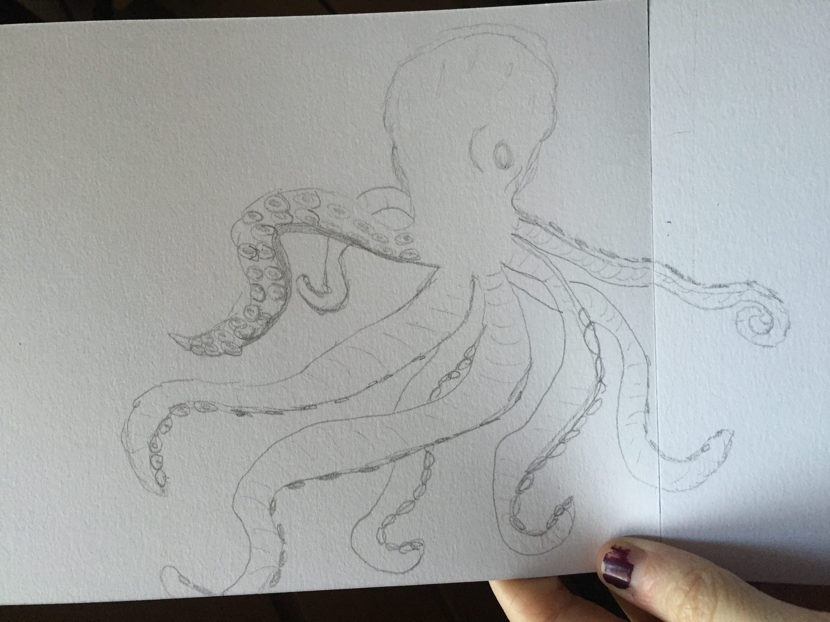
For my proposed design, I wanted to try and draw an octopus to scan in and use. Here it is:

To keep up the consistency of my work, I added a darker subtitle behind the ‘tattoo parlour’ as it did not look as professional as just one colour.

I decided to remove the lines on the outside of the lighthouse as I feel it looks better without them and does not need them.

I made the lines white so that they stand out against the stripe. I feel the contrast works well.

I have now decided to get rid of the bars around the top of the lighthouse and replace it with this simple bar across to represent a platform instead. I feel this looks tidier than the bars I had before.

Since looking at other tattoo shop logos, I decided to start creating some of my own to get an idea of what mine could look like. I stuck with the nautical theme and drew out a lighthouse, ship steering wheel and other nautical items on Illustrator for me to use in my logo. Here are four of my current logo designs:

This is the first design I thought of. I like the idea of a lighthouse as they are a beacon and an important building for guiding ships. I chose quite a rustic blue for the background and then went with the Baskerville font for the type. If I did use this logo, it is not complete, but I quite like the idea of having a coloured background.

I wanted to try and draw a boat using one line which is what I have done here. I would draw it by hand and scan it in if I were to use this one line boat design (one line designs are popular tattoo designs). I do this it is quite a nice idea as it is incredibly simple and easy to recognise.

I decided to go back to my lighthouse design to create this. I am currently trying to colour in the second stripe on the lighthouse as for some reason Illustrator does not recognise it as an area to fill. I like the way the sun and the top of the lighthouse have merged to create the shapes for each other. I placed a slightly darker title under the light blue one to create a 3D effect on my title. This is probably my favourite logo design at the moment.

Crosses are quite a typical nautical logo design (they are also slightly hipster like Shoreditch!) so I thought I would have a go at making one of these. I am happy with the design but I am not sure if it is a little too stereotypical for my logo.
I have come across a website that creates logos for tattoo shops.
Here is a screenshot of some of the logos they have created:

These are all very traditional logos for standard tattoo shops. They also do not appear to have any particular theme and have just gone for images that represent the names of the shops. Even though they are very good illustrations and successful logos, I do not particularly like them and I do not think I will particularly use them for inspiration.
https://thelogocompany.net/tattoo/
The website does, however, offer some good advice in terms of typography and colour choice etc which may prove more useful.