Tattoo Shops in Shoreditch

Before I create my own corporate identity package, I thought I had better look at the Shoreditch competition:


Screen Shot 2016-01-20 at 11.20.11


Cloak and Dagger have a one-off tattoo parlour in Shoreditch. They have a range of traditional and neo-traditional tattoo artists and will more or less create anything that the customer wants. I like the logo for this shop – it is quite informal and bold. I like the use of orange and the rust colour as they are not very stereotypical for tattoo logos. The alternating text works well separating the two words apart. The company’s little logo next to their name in the tab is an anchor, which partly ties in with the High Seas nautical theme.

Screen Shot 2016-01-20 at 11.50.02

The website is very simplistic – they have placed their images in circles and the text and background is just black and white with a hint of orange. I feel the website is actually quite boring and does not convey any ideas of tattoos and Shoreditch to you at all.


Screen Shot 2016-01-20 at 11.58.50

Good Times Tattoo are another independent tattoo shop in Shoreditch. I like their take on the ‘I <3 NY’ logo that has become a global success. The font appears to have been typed out on the screen, like it has been written with a different kind of ink, which could be said to be ironic. I like how it is just black and white too as most tattoos follow this colour scheme too.

Screen Shot 2016-01-20 at 12.05.04

Their website is also very clean and simple with just photos of the parlour, tattoo artists and work that the artists have done. The clear, white background could give an indication that the shop is a clean and trustworthy shop which can be a big issue when people are choosing where to get their tattoo done. There is also a map of where the shop is, which is hopeful for first timers.


Screen Shot 2016-01-20 at 17.30.43


Price is Shoreditch’s first tattoo shop. I like the use of the simple, single lined logo which appears to be a combination of a heart and some infinity shapes. The well spaced, capital, sans serif font compliments the simple logo well, giving the shop a clean and simple feel again. I like the introduction of the light blue/teal colour to the black and white too.

Screen Shot 2016-01-20 at 17.35.59


Their website looks a little bit like a Tumblr blog with the large amount of photos in it. I like how they have centralised the type at the top of the site and feel that this website is slightly more appealing to the eye than some of the other sites I looked at.


Screen Shot 2016-01-20 at 17.38.37


I feel the logo for this tattoo shop is stronger than some of the others, although conveys a different image. It is darker and more gothic with the serif scroll-like font. The type makes me think of the Sons of Anarchy design, and I would say it is more masculine than the others. It also suggests they draw different kinds of tattoos to the other shops.

Screen Shot 2016-01-20 at 17.40.43


I feel the homepage for this parlour is a bit bare and could do with some images added to it. The black and white colour scheme is strong with the textured background and gothic look though.


Screen Shot 2016-01-20 at 17.42.00


I have found a nautical themed tattoo parlour in Shoreditch. The main website is similar to this ‘enter’ page, with a scroll style background and images of mermaids and other sea-themed objects around it. I am not a massive fan of the traditional pirate style that they have gone for and think that High Seas will look really different to this despite them sharing a nautical theme.

Kraken Rum

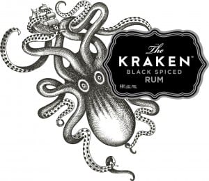
For my website and possibly logo, I have had the idea of having a large octopus on the screen. A brand that already successfully uses an octopus is Kraken Rum.


kraken-logo-high-res-1


This is the Kraken logo. I love the hand drawn octopus design with its wild eyes and tentacles waving about everywhere. I also like the way the octopus has been shades with dots. The addition of the boat also works well, as well as tying in with the legend of a rum boat vanishing in the sea and possibly being taken by a giant octopus.

The area around the text looks like an ink splodge crossed with an old fashioned rum bottle label in pirate films. The entire logo does bring pirate films to mind with its old fashioned look and the fact it is rum.

The like the calligraphy style type for the ‘The’ and then the widely spaced sans serif type below. The difference between the white and grey type makes the important areas stand out (the name) adding priority and order to the logo.


This is a screenshot of the website:

Screen Shot 2016-01-20 at 11.10.47

The wbsite has a simple layout with the menu bar down the left hand side and then a video taking up the majority of the screen. The use of black and white works well as it makes the product appear as though it is under the sea. Theimages below the video are gifs that move as you scroll down, adding interest to the page. I like the gritty sans serif 3D font on the video and feel it works really well with the pirate style of the page.

Screen Shot 2016-01-20 at 11.13.39This is a screenshot of the top of one of the pages on the Kraken website. I love the old look to it, as though it is a really old film or chalk board. I like the use of tentacles as the swirly bits above the title of the page as well as the combination of fonts on the page.

Brief 3 ideas!

For our third brief, the corporate identity package, I am very interested in the tattoo company idea and the estate agency. I initially thought that I would look into the barber shop, but then decided that the route that I would go down would be too stereotypical and I would just be using basic barber shop vectors. I also do not know much about male facial hair, whereas I am interested in property and nautical themes and watch the programme Tattoo Fixers, which ties in nicely with the tattoo brief.

First of all, I thought I would look at some corporate identities that other people have designed on Pinterest:

I like the logo on the photo of oysters as well as the hand-drawn fish that this man has created. It also ties in with the nautical theme of the tattoo brief. Not only has he designed a logo, but some bottle ideas and bags as well as other branded items. This looks similar to all of our branding briefs and so I feel these photos are relevant.

oysters

fish

This is another nautical branding package that I love. The pastely pale colours along with the simple sea creature designs work really effectively. I also like the way the products have been laid out to be photographed.

Screen Shot 2016-01-20 at 10.30.41


This is the logo of a barber and tattoo shop in America. I feel it has a simple but effective design with the little images of a tattoo pen and razor. I like the use of black and gold – I feel like the black works well for the line of business and then the gold makes it stand out as a successful company.


Screen Shot 2016-01-20 at 10.35.37


This is the website of a high-end estate agency in Suffolk (where I live) although I think they are nationwide. I have noticed they have used the colour gold with black and white again, making it look a prestigious company before you know what it is. The little logo of a pillar/column adds to the upmarket approach the company are going for. I like the easy look to their website and feel that their branding works well.