It’s all about detail

I wanted to add some little, not necessarily noticeable details, to my infographic. Here are some examples:

Screen Shot 2015-11-17 at 21.22.09

I decided to add a curve to this box. This is because the fact above it is about ‘curvature’, and so I thought adding a curved bottom to the box would add to this fact, as well as make the box look more interesting.

Screen Shot 2015-11-17 at 21.22.15

This fact is about speed, and a way of portraying speed is often by using arrows. I then decided to change the shape of the box by adding two arrows on the sides of it, to visualise the idea of speed.

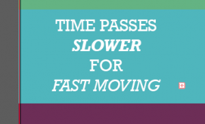
Screen Shot 2015-11-17 at 21.25.42

To make the word ‘slower’ actually appear to be slower, I decided to make the text bold and italic, as though it is heavier and so being slowed down. I then made the ‘fast moving’ light and italic, to make it appear as though it is moving fast and is lighter than the word ‘heavy’.
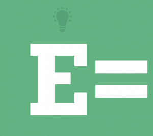
Screen Shot 2015-11-17 at 22.25.10Einstein had a lightbulb moment when coming up with the equation E=MC2, so I decided to give ‘E’, which could represent Einstein as well as energy, a lightbulb too.

Progress

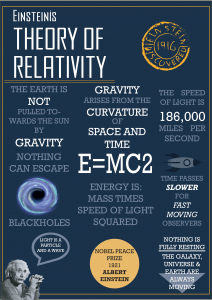
This is the first infographic I created:

Relativity print copy1

Things I like about this

  • The space colour scheme from Adobe Kuler
  • The typeface used for the title
  • The typeface for the main body
  • The stamp I created in the top right corner

Things I don’t like

  • The layout is messy
  • There is no hierarchy
  • The bottom speech bubble

So after creating my first infographic, I decided I would go back to looking at other people’s infographics. I needed to work on the hierarchy of my information as there was no order on my page, so I initially thought of turning my infographic into a giant, colourful grid to try and make it easier to read.

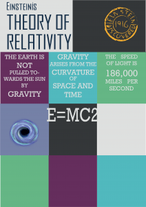
This is my second attempt:

Idea 2

Things I like

  • The new colour scheme – there is more variety than with the first one

Things I don’t like

  • The squares system does not work
  • Still no hierarchy

So after creating this, I noticed something else about other infographics: they are often long so the viewer has to scroll down, which creates hierarchy and an order of reading on the page. So I decided to create a longer infographic where my reader will have to scroll down or read down the page too. To separate the information, I then decided to put my information in boxes that span across the page.

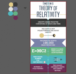
My third attempt:

Screen Shot 2015-11-17 at 21.00.40

It is still working progress, hence the screenshot with my colour scheme on Illustrator. However, I much happier with this final infographic idea. It still fits an A2 page, but is easier to read, more pleasing to the eye and has an order to it.